Mobile Page Web Design
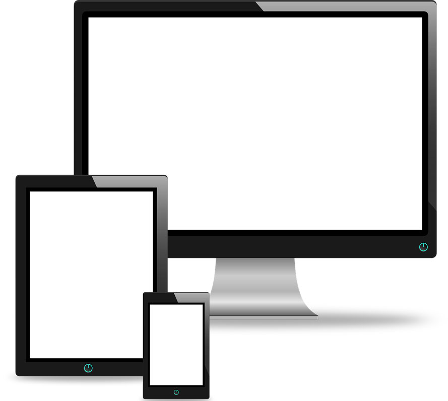
Mobile Page Web Design. Mobile search and website browsing has become more popular than desktop over the last five years. It’s worth keeping in mind a few points when designing your website mobile pages. Phone and tablet screens are generally smaller than desktop, so layout is vital for the user to navigate and absorb information. This will differ on mobile to desktop but the site should still be immediately recognisable on all devices, as a visitor may alternate from one device to another. Logo and colours should be visible at first glance to reassure the site visitor is on the same website. Navigation menu is important, this differs on mobile devices to desktop, due to screen shape and area. On a desktop, top or side menus with dropdown submenus are easy to use. On a mobile device the main menu should be easy to see, it is usually located at the top of the screen to the right or left. Consisting of horizontal lines to indicate it is the menu. When clicked it opens up as one long dropdown. Submenu’s availability is shown by a “>” greater than symbol, when clicked on opens up navigation options. This method is clean and does not cover information on the page you are navigating from. Items to avoid are cluttered designs and slow loading pages. This will be frustrating for a user and they may just give up and go elsewhere. A well designed and easy to use mobile website design, will entice a visitor to subscribe, return and follow a site for updates, refer your site and products to other potential visitors. Which will help with building a good and loyal client base. Websites are becoming more sophisticated by the day, so it’s essential to keep your website mobile pages up to date with all the new and proven design techniques. Regular updates and fresh new look and ideas can only put your site ahead of the game.